You’re a great psychologist. You know it. Your clients know it. But the website you keep meaning to fix still says “Coming Soon,” or it loads a template you bought two years ago that doesn’t sound anything like you. And every time someone asks for your link, you wince a little before you send it.
That gap between how good you are and how your site makes you look is the whole problem. Let’s close it.
The short answer: Good psychologist website design earns a stranger’s trust in about five seconds and makes booking a first session feel safe and obvious. A strong therapy website needs four things: a clear headline naming who you help, your photo and credentials up top, a plain explanation of how to start, and one visible booking button on every page. You can build this yourself with a clean template, or have a 3-page custom site designed and launched for you in under a week.
What makes psychologist website design different from any other business site
Psychologist website design carries one job no other industry shares quite the same way: it has to make an anxious, often skeptical person feel safe enough to email a stranger about their pain. That single emotional hurdle changes every design decision.
A consultant’s site can be slick and aggressive. Yours can’t. Someone considering therapy is usually nervous, sometimes in crisis, and almost always reading your words at 11pm on their phone. They’re scanning for two things. Are you the kind of person I could talk to? And is this going to be a hassle to start?
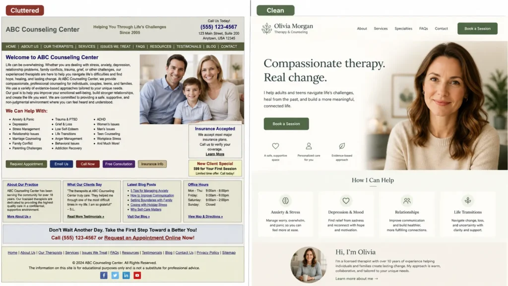
Warmth beats polish. A real photo of your actual face beats a stock image of a lighthouse every single time. Calm colors, generous spacing, and a reading level a tired brain can follow at midnight will do more for your bookings than any clever animation.
The five pieces every therapy website actually needs
Every effective therapy website includes five core pieces: a clear headline, a credible photo and bio, a plain description of your specialties, an obvious next step, and basic logistics like fees and location. Skip any of these and people leave to check the next name on their list.
Here’s the order that works, top to bottom:
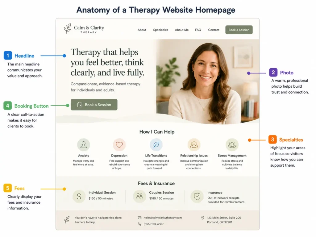
- A headline that names who you help. “Therapy for anxious high-achievers in Austin” tells the right person they’re in the right place. “Welcome to my practice” tells them nothing.
- Your face and your credentials. A warm, well-lit photo near the top, with your license type spelled out. People want to see the human before they trust the human.
- Specialties in plain words. List what you treat the way clients describe it, not the way the DSM does. “Panic attacks” and “feeling stuck after a breakup,” not only “anxiety disorders” and “adjustment issues.”
- One clear way to start. A single button, repeated on every page: “Book a free 15-minute call” or “Email me to schedule.” Don’t make people hunt.
- The boring practical stuff. Fees, whether you take insurance, in-person or virtual, and your general location. Hiding your rate doesn’t get more inquiries. It filters out the people who’d have booked and annoys the ones who email just to ask.
What kills trust on a private practice website
The fastest trust-killers on a private practice website are a missing or low-quality photo, walls of unbroken text, no visible pricing, and a contact process that takes more than two clicks. Each one quietly sends a nervous reader somewhere else.
I’ve watched this trip up so many smart, capable people. They pour everything into their clinical training and treat the website as an afterthought, so it ends up looking like an afterthought.
A few specific things to fix today, even before you redesign anything:
- Stock photos of strangers laughing on couches. Replace with a photo of you, or nothing.
- A wall of “My Approach” text in 200-word paragraphs. Break it up. White space reads as calm.
- A contact form with eleven fields. Name, email, and a message box. That’s plenty.
- An autoplay video or a pop-up. For someone already on edge, that’s the door slamming.
If your site does its job, a stranger should be able to land, exhale a little, and think “okay, I could actually talk to this person.” That feeling is the entire goal of psychotherapy website design.
Should you build it yourself or hire someone?
Build it yourself if you have the time, a decent eye, and the patience to write your own copy; hire it out if the project has been sitting on your to-do list for six months with no movement. Honesty about which camp you’re in saves you the most time.
A capable DIY therapist can get a clean site live on a template platform in a weekend or two. The hard part is rarely the technology. It’s writing about yourself without sounding either stiff or boastful, and making a hundred small design choices that add up to “calm and trustworthy” instead of “busy and amateur.”
If you’d rather skip all of that, The St. Carlo custom website is the shortcut. It’s a 3-page site (Home, About, Services and Contact) designed, written, and launched for you in 5 to 7 business days for a one-time $1,297 with a 30-day money-back guarantee. You hand over the details about your practice, and it comes back ready to send to the next person who asks for your link.
How to plan a therapy website that books more clients
To plan a therapy website that books clients, start from the reader’s nervous first visit and work backward, deciding the one action you want them to take before you write a single word. Everything on the page should point at that action.
Here’s a simple process that works whether you DIY or hand it off:
- Pick your one main action. Usually a free consult call or a direct email. Choose one. Two competing buttons split attention.
- Write your headline first. One sentence naming who you help and how. If you can’t say it in a sentence, the rest of the site will wander.
- Get one good photo. Natural light, plain background, you looking at the camera like you’re about to listen.

This one asset moves the needle more than anything.
- Draft your three pages. Home (who you help, your photo, the button), About (your story and credentials in plain language), and Services and Contact (what you treat, fees, how to start).
- Cut a third of your words. Then add your booking button to every page and launch. A live, imperfect site beats a perfect one that never ships.
If a blog matters to your plan, say you want to write about anxiety or parenting to attract search traffic, a content-ready WordPress build like The Mother Angelica gives you room to publish over time. For most psychologists, though, a tight 3-page site does the booking work just fine.
What it costs to stay stuck
The real cost of an outdated or missing website isn’t the redesign fee. It’s the clients who searched your name, hesitated at your “Coming Soon” page, and booked the therapist whose site made them feel safe instead.

You don’t see those people. They never email. They just quietly choose someone else, and you never know it happened. Meanwhile the months of “I’ll get to the website soon” stack up, and the avoidance starts to feel like proof you can’t do it.
You can. The whole point now is making solopreneurs look online the way they already are in the room. If you’d rather not spend your weekends learning web design, The St. Carlo custom website gets you a finished, professional site you’re proud to send, in about a week, for $1,297 one time.
Frequently Asked Questions
How much does psychologist website design cost?
Psychologist website design typically ranges from a few hundred dollars for a DIY template to several thousand for a fully custom build. A done-for-you option like The St. Carlo is a one-time $1,297 for a launched 3-page site, which lands between paying a freelancer hourly and wrestling with a template yourself.
What pages does a therapist website need?
A therapist website needs three core pages: a Home page, an About page, and a Services and Contact page. Home names who you help and shows your booking button, About shares your story and credentials in plain language, and Services and Contact lists what you treat, your fees, and exactly how to start.
Do I need to show my fees on my private practice website?
Yes, showing your fees on a private practice website helps more than it hurts. Listing your rate filters out price mismatches before they email and signals confidence and transparency, which is reassuring to someone already nervous about reaching out.
How long does it take to build a psychotherapy website?
A focused psychotherapy website can be built in a weekend if you DIY with a template, or in about 5 to 7 business days with a done-for-you service like The St. Carlo. The slow part is almost never the technology; it’s writing the copy and making design decisions, which is exactly what a done-for-you build handles for you.
Should a psychologist use a website template or a custom site?
A psychologist should use a template if they have the time and eye to customize it well, and a custom site if they want it written and designed professionally without doing the work. Templates are cheaper but demand your hours and judgment, while a custom build like The St. Carlo trades a one-time fee for a finished site in under a week.
What makes a therapy website feel trustworthy?
A therapy website feels trustworthy when it leads with a real photo of you, states your credentials clearly, speaks in plain calm language, and makes the next step obvious. Nervous readers decide in seconds, so warmth, clarity, and an easy way to start matter more than flashy design.
You became a psychologist to help people, not to fight with a website builder at midnight. So either follow the plan above and ship your own site this month, or let The St. Carlo custom website handle the writing, design, and launch for you. See how it works, and then go back to doing the part only you can do.

Is your website making you look amateur?
Download "5 Reasons Your Website Makes You Look Amateur (and How to Fix Each One)." In 5 minutes, you'll know exactly what's hurting you and what to do about it.
Free PDF · No spam · Unsubscribe anytime · Join 450+ solopreneurs